With mobile devices dominating the way people access the internet, it’s no surprise that Google has shifted its priorities. If your website isn’t optimized for smartphones and tablets, you’re already falling behind. Mobile-First Indexing is no longer a suggestion-it’s a standard.
This guide breaks down everything you need to know to future-proof your site, improve rankings, and ensure your business remains competitive in the ever-evolving digital landscape.
What Is Mobile-First Indexing?
Mobile-First Indexing means Google primarily uses the mobile version of your website’s content to index and rank pages. Even if a user searches from a desktop, Google still evaluates your site based on its mobile presentation.
In the past, desktop versions were prioritized, but as mobile use skyrocketed, this no longer made sense. Google now expects your mobile site to be the primary version, not a lightweight alternative.
Why It Matters for SEO
- Mobile determines your rankings: If your mobile site is incomplete, poorly structured, or slow, your rankings will drop-even for desktop users.
- User behavior is mobile-first: More than half of global traffic comes from mobile. If your site isn’t mobile-friendly, visitors leave quickly.
- Googlebot is mobile-first: Google crawls your website with a smartphone agent. Anything it can’t access won’t be ranked.
Ignoring this trend can severely harm your visibility and growth.
Benefits of Mobile-First Indexing
- Better Rankings
Optimizing for mobile ensures you’re not penalized by Google’s algorithm and helps you reach users more effectively. - Improved User Experience
Mobile-first design improves navigation, readability, and speed-keeping visitors engaged and reducing bounce rates. - Future-Proofing Your Business
As more users shift to mobile, building with a mobile-first mindset ensures you won’t need to rebuild later. - Faster Load Times
Mobile-optimized pages tend to load faster, which also improves your SEO.
Key Mobile-First Indexing Best Practices
1. Use Responsive Web Design
Responsive websites adapt seamlessly to any screen size. This means the same URL serves both desktop and mobile users, but the layout adjusts based on the device. It’s easier to maintain and more SEO-friendly than creating separate mobile and desktop versions.
2. Ensure Content Parity
Make sure your mobile site includes the same:
- Text and headings
- Images
- Videos
- Structured data
- Internal links
If your mobile site is missing content that exists on your desktop version, Google might ignore it entirely.
3. Optimize Core Web Vitals
Google uses Core Web Vitals to assess page experience. Focus on:
- Loading speed (LCP): Your largest content should load within 2.5 seconds.
- Visual stability (CLS): Avoid unexpected layout shifts.
- Interactivity (INP): Ensure the site responds quickly to user actions.
4. Design for Mobile UX
Think thumb-first. Key UX features for mobile include:
- Large, tappable buttons
- Readable font sizes (at least 16px)
- Minimal popups
- Streamlined navigation
- Clear call-to-actions
Good mobile design isn’t just about fitting a screen-it’s about creating a smoother, easier experience.
5. Make All Resources Accessible
Don’t block CSS, JavaScript, or image files. Google needs access to everything in order to understand your content properly.
6. Optimize Page Speed
Mobile users have less patience. Compress images, enable browser caching, minimize code, and use lazy loading to speed up your pages.
7. Use Identical Metadata
Meta titles and descriptions should be the same on mobile and desktop versions. Any discrepancies can confuse search engines and hurt click-through rates.
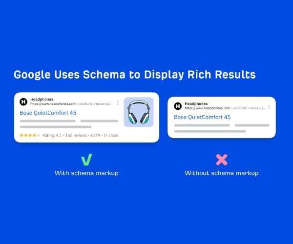
8. Audit Structured Data
Ensure your mobile version includes the same schema markup so you remain eligible for rich snippets and enhanced search results.
Common Mobile-First Mistakes to Avoid
| Mistake | Why It’s a Problem |
| Hiding content on mobile | Google won’t see or index that content |
| Using separate URLs (e.g., m.example.com) | Harder to maintain and more prone to errors |
| Ignoring mobile speed optimization | Slower sites get ranked lower |
| Missing or incorrect metadata | Affects click-through rates and rankings |
| Poor navigation on small screens | Frustrates users and increases bounce rate |
Testing Your Site for Mobile-First Indexing
You can run a few easy checks to make sure your site is ready:
- Google’s Mobile-Friendly Test: Tells you how well your site works on mobile.
- PageSpeed Insights: Offers detailed performance reports and suggestions.
- Manual checks: Simply browse your site on different phones and tablets. If anything feels clunky or hard to use, fix it.
Mobile vs. Desktop Content
Imagine a blog post that’s 2,000 words long on desktop, full of images, videos, and structured data. Now imagine the mobile version trims it down to just 500 words with none of the media. Google sees only the 500-word version. The desktop content doesn’t matter if it’s not visible on mobile.
That’s why content parity is crucial.
FAQ: Mobile-First Indexing
Q: Does mobile-first indexing only affect mobile rankings?
No. It affects all rankings-mobile and desktop. Google uses the mobile version of your site to determine where you rank.
Q: Should I still have a desktop site?
Yes, but it should mirror the mobile version. Think mobile-first, but make it responsive.
Q: Do I need a separate mobile site (m.domain.com)?
No. It’s better to use responsive design. Separate sites are harder to manage and often lead to mistakes.
Q: How do I know if my site is using mobile-first indexing?
Google Search Console will tell you. If your site was created recently, it’s likely already under mobile-first indexing.
Q: How often should I audit my site for mobile performance?
At least every quarter, and always after making major updates to design or content.
Final Thoughts
Mobile-First Indexing is no longer optional-it’s the new reality of SEO. Whether you’re a content creator, eCommerce brand, or service provider, optimizing your site for mobile is the key to staying visible, competitive, and future-ready.
Focus on responsive design, consistent content, fast load times, and exceptional mobile UX. With these foundations in place, your site won’t just survive the mobile era-it’ll thrive.